Charlemagne Langoustine
CASE STUDY
Brand Strategy
Logo Design
Photo Direction
Web Design
Digital Products
Social Media

When Carman came to us, her biggest challenge was getting designers to understand what she wanted and to get the true essence of the brand she had envisioned. There were failed attempts and it was taking them a long time!
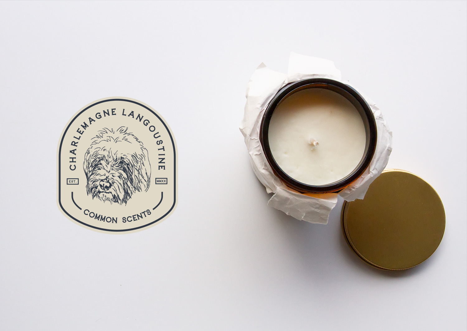
We were eager to get involved with her as we really could see the potential of an outstanding brand. So we booked her in for a 1-Day Design Intensive and we put together the brand design and the label concept for the candles.
THE VISION
Great quality, luxury pieces, not feminine or masculine just classic, wholesome pieces, that evoke the sense of the old country, but also has a sense of humour. Alternative to the mainstream - luxury but not pretentious. When you find a scent you like, it is like finding YOUR fragrance, your home's identity, the one it wears forever. apothecary. Warm. classic. artisanal.

Logo Design Process
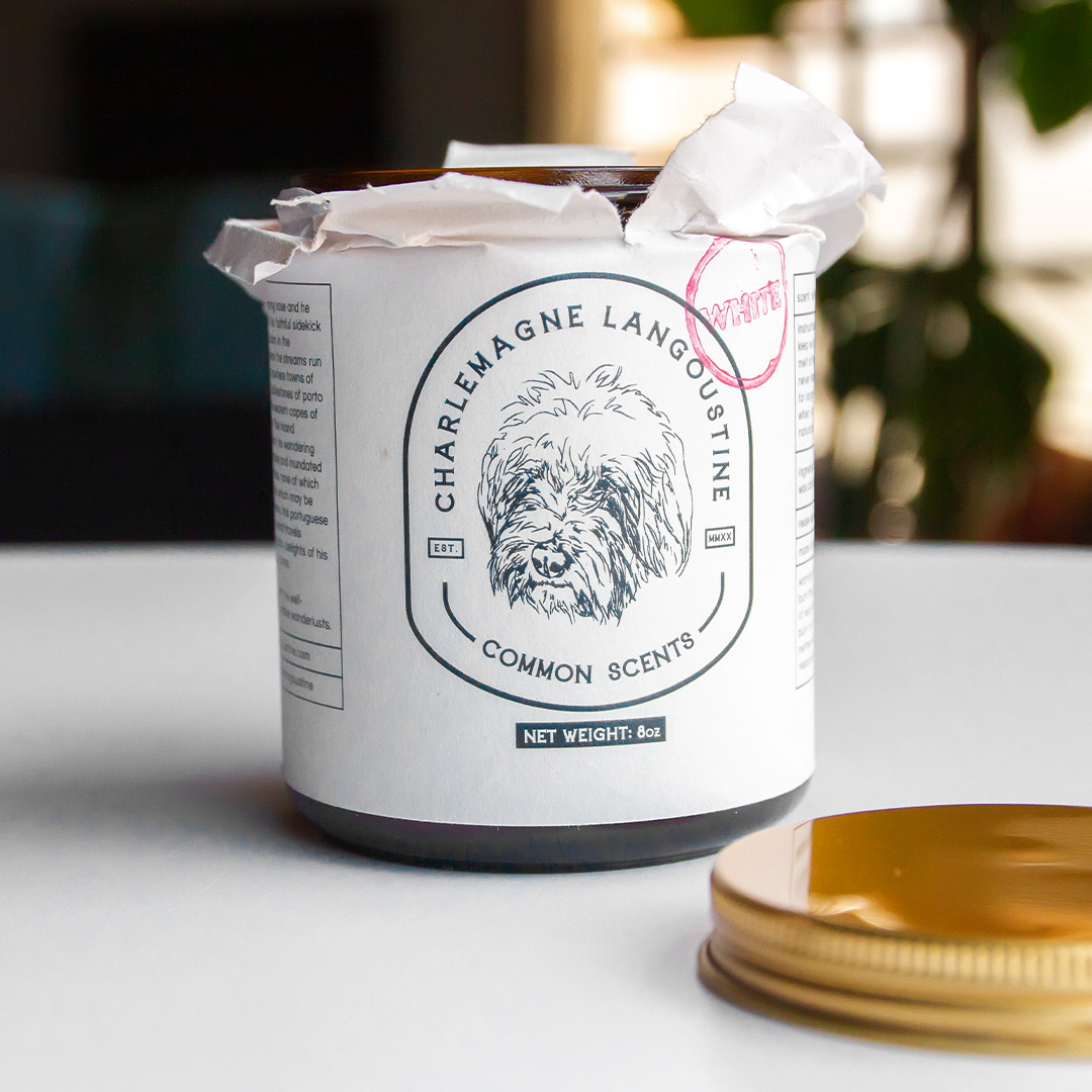
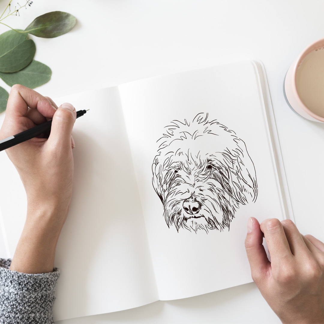
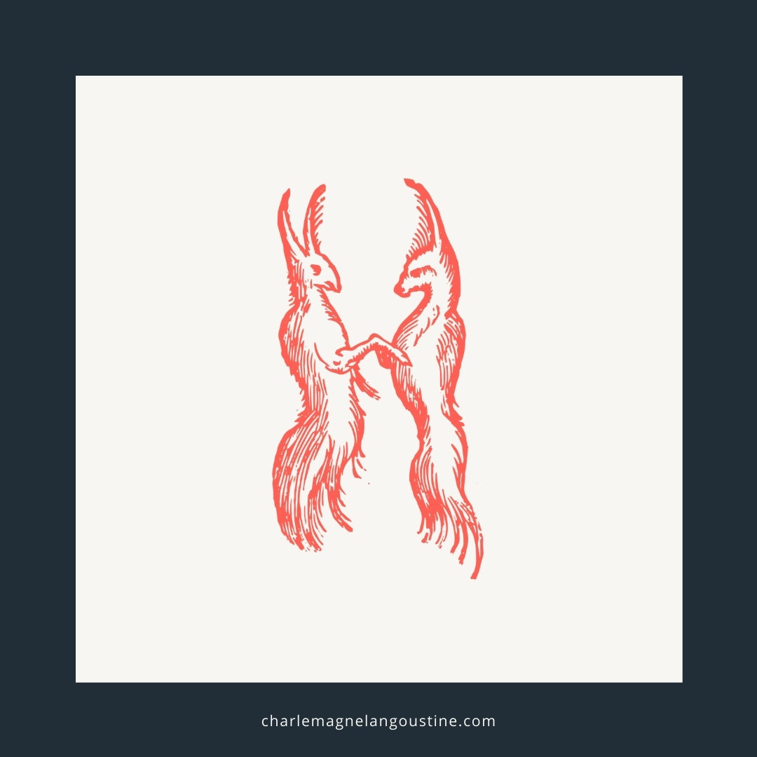
When Carman originally started chatting to us about her brand she already had two sketches done by a friend of her faithful companion Charles, Lezanne from @good_on_paper_illustration had done a really awesome line art drawing of Charlie so it was a no brainer this would be the 'icon' of the logo.
The other logo attempts Carman showed us was the brand name in shapes around Charlie's head, the idea was there but really we just needed to find the right shape. Typography layout fitting into shapes is no easy task however, Craig managed to create a shape that complimented the typography and really pulled it all really nice.
The logo came out really great, clean and classy. Craig imagined something further though, he really wanted a simple version of the logo, something that could be stamped. The monogram design was a simple CL, but the shape border shape was adapted from the original logo and gives it a unique shape and a unique look.

The Brand
No-frills
Juxtaposition
Old + fancy
Luxurious + simple
Awkward + cool
For people who care about what their home FEELS like. They appreciate luxury, vintage and are eco-conscious.
What the client had to say...
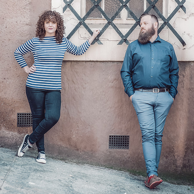
"The logo design is perfect, which resulted in the product label designs working out perfectly too, exactly, in fact better than expected.
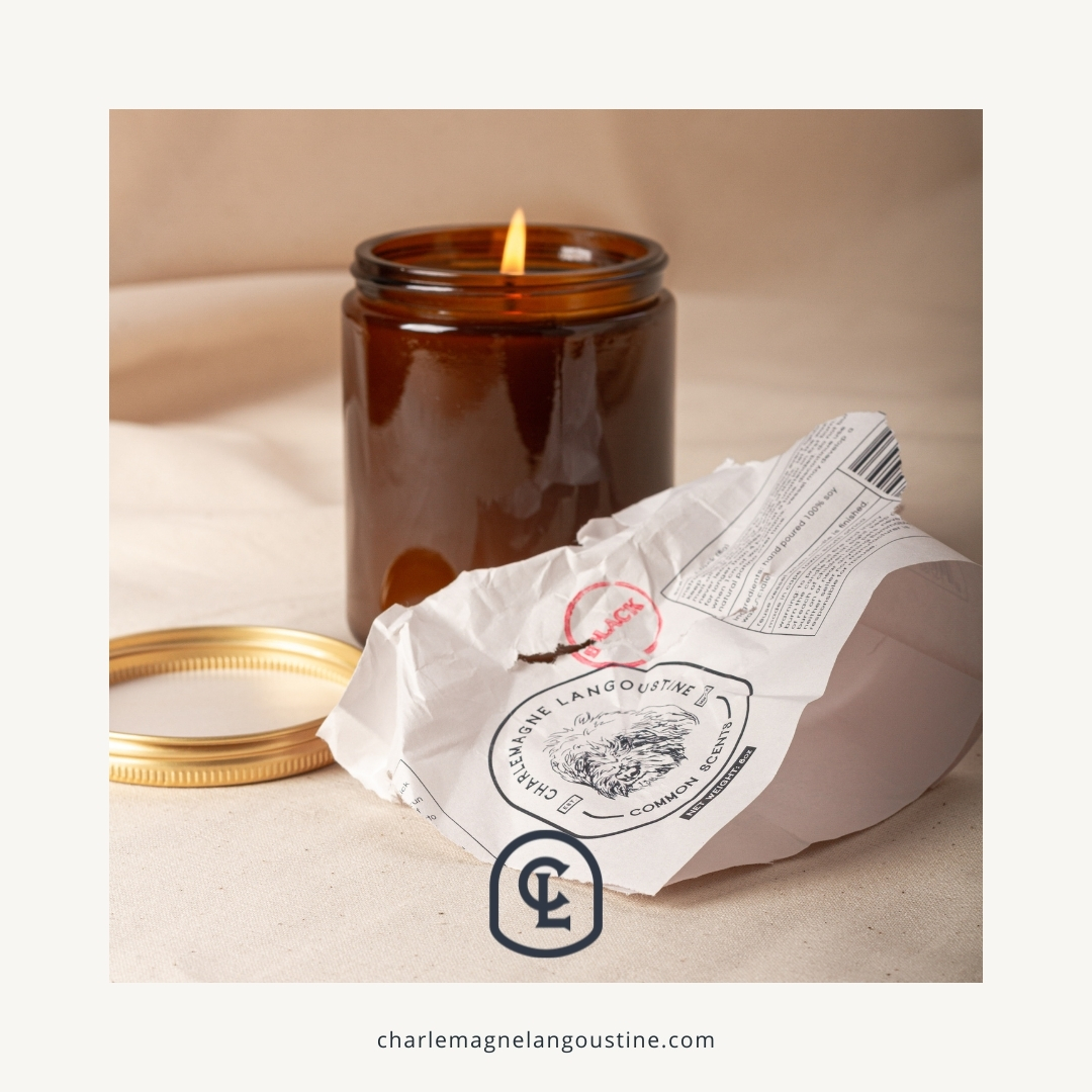
The website design and over feel really captured what I had in mind. Beautiful product shots taken and the social media help setup has absolutely saved me, and helped the brand story and style to be followed throughout.
Explanatory videos and recordings assisting with social media and woo-commerce has been ridiculously helpful, there is no way I would've been able to do it without."
